 Home
Home Browse
 Close
Close Events
 Maps
Maps Email
Email Brightspace
 eCampus

Vaccines are Beautiful . . .
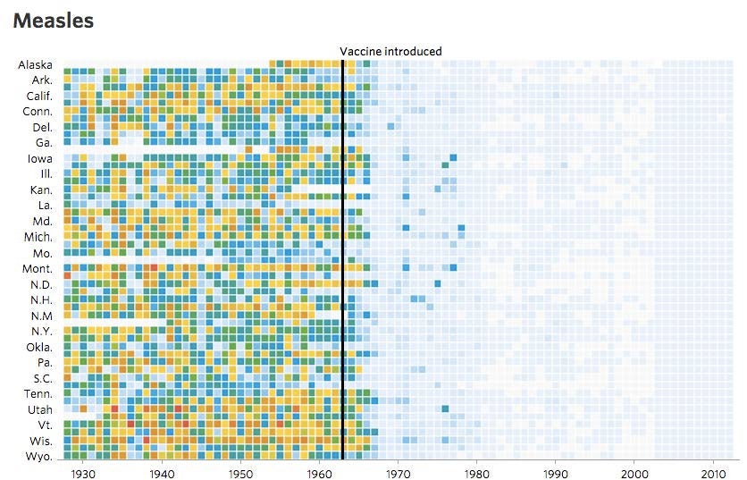
Tynan DeBold and Dov Friedman recently published an absolutely beautiful series of graphics that illustrate the impact of vaccines on infectious disease in the USA. The heat maps below show number of cases of measles per 100,000 people over about 70 years.
Remember – those are mainly children, who are sick (and sometimes dying) with measles, represented in this graphic. Does this leave any question in your mind about the importance of vaccination? As they say, a picture is worth a thousand words.
We have pasted a flat picture of the graphics here, but for the interactive graphic, visit the page at the Wall Street Journal. These graphics were made possible because of Project Tycho, a project at the University of Pittsburgh that made data from all weekly notifiable disease reports for the United States dating back to 1888 available to all big-data enthusiasts.
DeBold and Friedman used the data to develop an interactive graphical heatmap reflecting the the number of infected people for vaccine-preventable diseases, from the state-by-state, year-by-year information on specific diseases. What is beautifully clear, is that over the course of seventy years and across all 50 states, infectious diseases rapidly declined after vaccines were introduced.